
In Defense of Animals, also known as IDA, is a non-profit organization that promotes the welfare of animals. Currently about 85% of their user traffic comes from google and most of their donations come from their email newsletter. They are averaging 1 donation per 1,000 signatures (users who sign a petition for a specific cause from the newsletter).
Although IDA has a relatively even distribution of age demographics throughout their user base, the users who donate most often tend to be women over the age of 50. To increase conversion rates and grow their organization, IDA wants to create a more streamlined donation process and expand their user demographics.
To make the donation process accessible to all users and establish credibility to drive more donations.
Though we didn't need to do an entire redesign of the entire website, we still applied first principles design thinking into our analysis and redesign of the donation process.
Specifically, it was revealed through conversations with the members of the IDA that their preferred pipeline to engagement was to have the visitor sign up for their newsletter, and then having a donation request sent to them.
To that end, we designed for that specific pipeline.

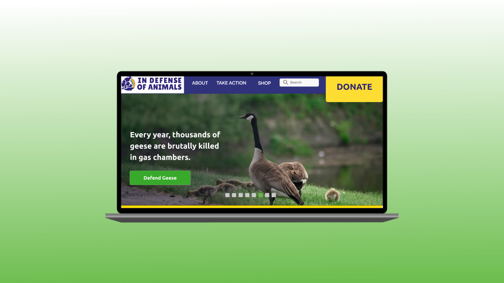
The IDA's original website had too many call to actions and information. A visitor could easily get overwhelmed on the landing page. We simplified the content on the page to make the input easier to process.
We showcased examples of what direct impact the donated amount could have. Bringing a conceptual idea of the worth of the dollar to specifics helped the visitor understand the significance of donating, affecting their motivation.


We made the newsletter more visually appealing to look at. In addition, the call to action for donating was easier to find and come across. There is a direct pathos appeal by showcasing IDA's efforts during the month.


Overall, with competitive analysis, we found discrepancies with IDA's donation flow and found inspiration for ways it could be improved.
We conducted a screener survey to evaluate what kind of trends exist when it comes to donating to charity. Our survey received 27 responses over the age of 18 and two outliers under 18.
The demographic of these users was as follows:
55% of those surveyed were between the ages of 25-34, over 60% identified as female, and over 70% were single/ unmarried.
The distribution for income was pretty evenly distributed.
Insights


We then interviewed 7 people with an age range from 25 - 54.
With the insights, first we created a map of the insights around the question, "How might we make the donation process accessible to all users and establish credibility to drive more donations?".

We then created an affinity map of all the insights we gathered from the interviews.

Builds Trust
Ways to reach more users
Motivation
Personal obstacles
Overall, we found that upfront tranparency and honesty were key, with the emphasis on what direct impact could come from your donations.
After distilling all the insights, I focused on three key areas:
The IDA team kindly allowed us to send a survey to their high engagement audience. We got a total of 607 responses, which revealed that the majority of high engagement audience are Caucasian Baby Boomers living in North America.
The main insights we received from the survey:
Based on the user insights and demographics from the surveys and interviews, we created 3 personas.


To better understand the flow that cumulates to become a relationship between IDA and a high engagement follower, we created an user story.

We created a user flow to understand the steps a user has to go through in order to donate.

We put together sketches to organize our ideas about what changes we wanted to make.


From the sketches, I then did a draft of the prototype as low fidelity wireframes.


I conducted remote usability testing on the high fidelity wireframes with 5 participants each.
Better navigation
People were having trouble navigating to pages where critical information was held
Easier donation flow
The donation flow could be made more efficient.
From the input gathered from the testers, I made some changes from the low fidelity wireframes to the high fidelity wireframes.


